Milano Design District

Milan Design Week is a new district born from the already existing Durini Design District. This last one differs from the other Milano Design Week districts in its unique nature: it was not born out of a territorial need or the will of the municipality, but out of a group of businesses that felt the urgency to create a shared identity. However, the Durini District identity today fails to perform the task of representing all businesses, instead creating an identity that is not very meaningful and inclusive for its member companies.
The concept – presented in collaboration with Carlotta Bacchini – aims to give birth to a dynamic identity to allows companies from different sectors to feel represented and part of a common thought: Milan is Design.
In this way,its territorial location expands to the entire city, providing a broader and more inclusive platform for businesses.
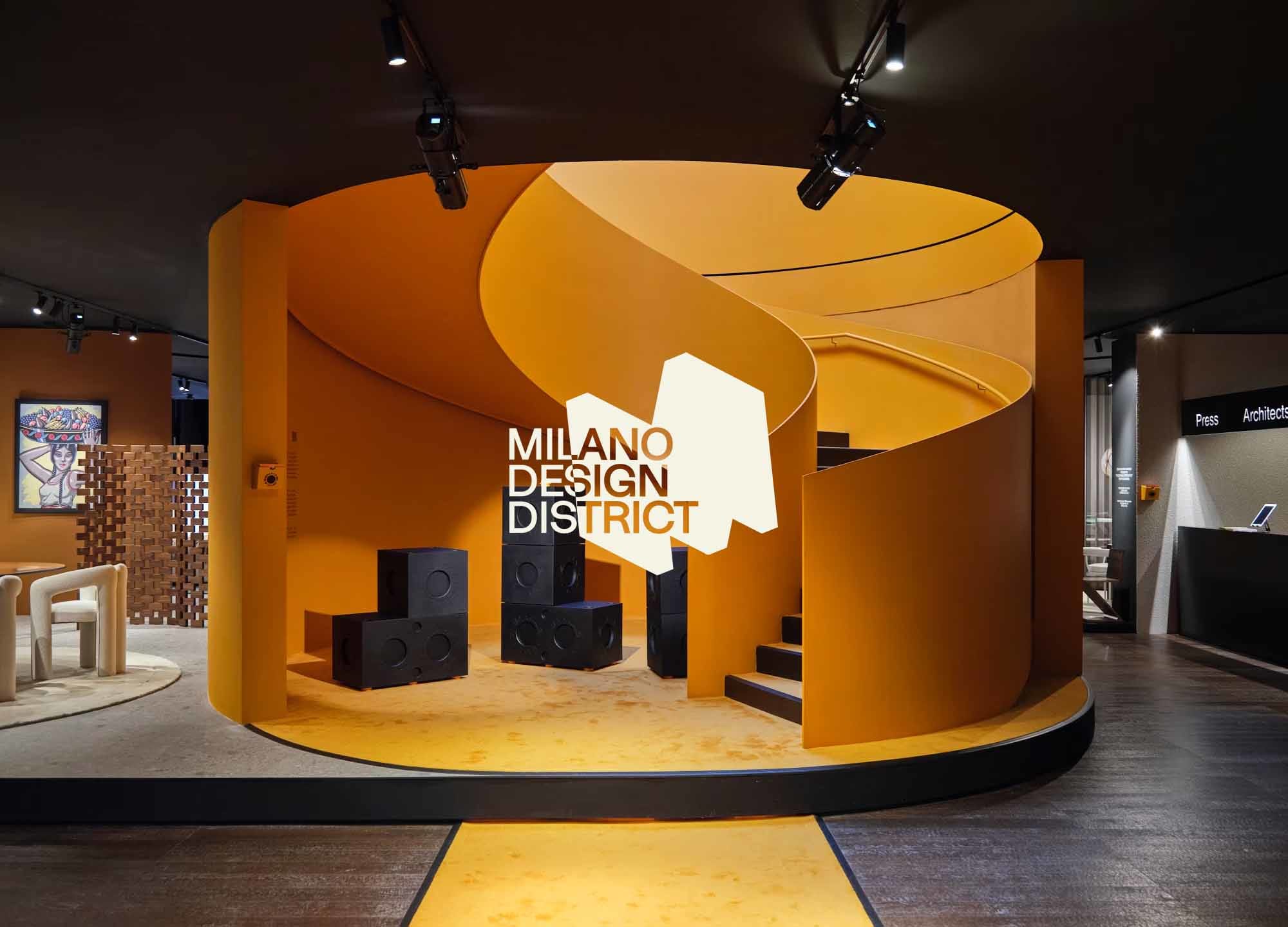
The logo is composed of the wordmark "Milano Design Week" in a fresh, innovative and design-driven font developed by a small studio in Barcelona. It thus results in a valuable and distinctive product.
The wordmark is flanked by a monolithic M, which represents Milan in all its grandeur and importance in the design industry. The letter is dynamic and assumes different positions depending on the company
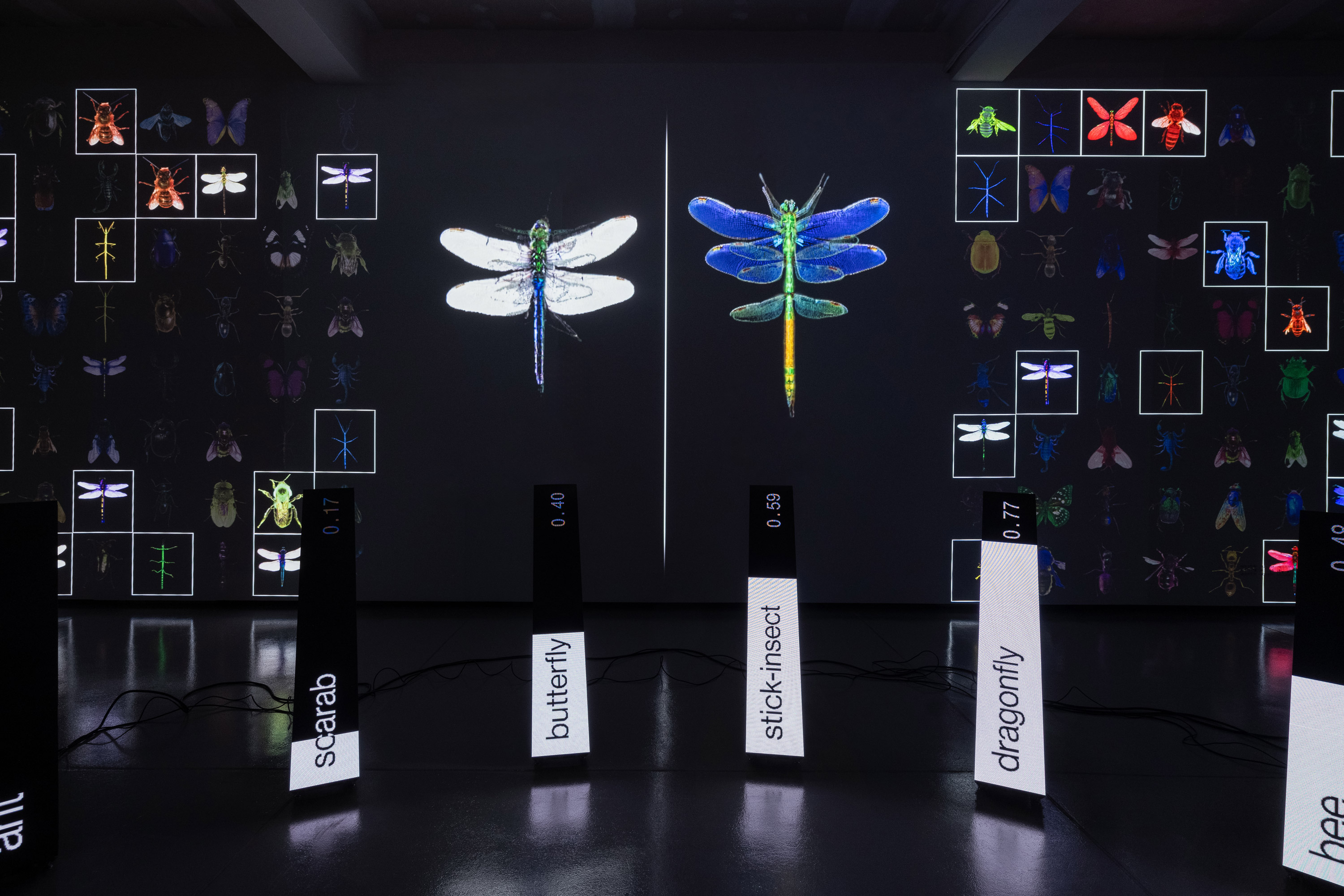
it refers to, thanks to a parameterization given by the address, the type of product and the year the company was founded. The identity takes shape thanks to the different points of view that companies
in the Via Durini area have on design, ranging not only in terms of sectors, but especially in terms of styles and visions. This spectrum of perspectives is the basis of the dynamic aspect of identity,
in which the three-dimensional element also becomes the canvas on which brands can freely express themselves visually.


